Glovo • 2022
Store Browsing Experience
Redesigned the store card to make room for promotions, Prime benefits, ratings, and trust signals while keeping stores easy to scan and compare
Browsing
Information Hierarchy
Promotions & Loyalty
Context
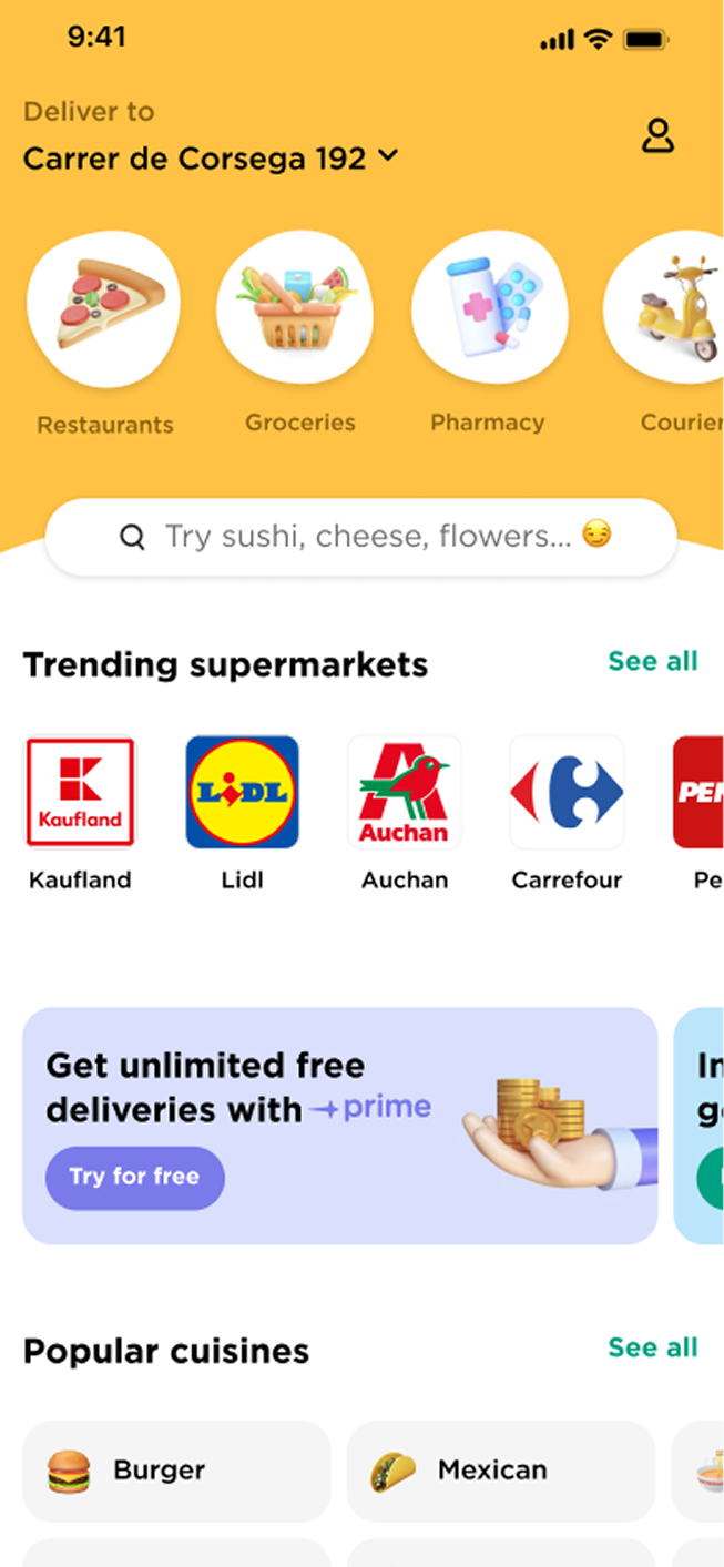
The store card is one of the main components in Glovo’s browsing experience. It appears across the Store Wall and Homepage widgets, and helps users decide which store to order from.
Over time, the card had become one of the most pressured components in the product. Different teams needed it to communicate promotions, Prime benefits, Google ratings for stores without Glovo reviews, and lighter trust signals such as “Trending” or “Hidden Gem”.
The redesign started more from design concerns than from a direct business request. While teams could still test new elements on the existing card, the design team saw that the component was reaching its limits. I prepared early wireframes and used an executive design review to make the case for redesigning the card instead of continuing to add elements to the existing structure.
Problem
The store card was trying to support too many competing needs at once.
Key challenges:
- More information had to fit into the card, including promotions, loyalty benefits, ratings, and trust signals.
- The card was becoming harder to compare quickly while browsing.
- The same component had to work across different placements, including the Store Wall list view and smaller Homepage widget variants.
- The card had to scale across markets, languages, alphabets, and currencies.
- There was no clear system for deciding which information should be prioritised.
-
This made the card harder to use and harder to adapt as new content needs appeared.
Approach & Decisions
I approached the redesign with two main goals:
- Make the card easier to compare while browsing.
- Create a structure that could support additional content without redesigning the component each time.
A previous survey in Nigeria, Poland, and Spain showed that users valued different information when choosing a store. In some markets, rating mattered more; in others, delivery time or delivery fee was more important. This raised the question of whether the card should eventually support different information hierarchies by market.
Although market-specific card variants were not prioritised at the time, I wanted to make sure the component structure would not block that possibility in the future.
Scalability was also an important constraint. Glovo operated across many countries and languages, including different alphabets and currencies, where text length could vary significantly from the English version. The card needed to remain usable even when labels, prices, and category names became much longer.
Design decisions:
- Established a clearer hierarchy for the information users rely on when choosing a store.
- Removed text overlays on images to reduce visual noise.
- Created a more modular structure for promotions, ratings, delivery information, and trust signals.
- Designed the card to work across different placements, including full-width Store Wall cards and smaller Homepage widget cards.
- Considered multi-language flexibility, so the layout could handle longer text and different currencies.
Research & Validation
Testing helped clarify which elements supported decision-making and which added noise.
Users generally understood Prime and conditional discount messaging after copy updates, while the “+2” promotion indicator was not clear enough for many users. Google ratings were useful where Glovo ratings were missing or less trusted, but some lighter trust markers, such as “Trending” or “Hidden Gem”, risked being misunderstood.
Stakeholders also had open questions around promotions and loyalty: whether it was fair to show only one promotion when a store had several, whether non-Prime users understood the benefit of subscribing, and whether Prime users understood the value they were already receiving.
We questioned whether the store card was the right place to communicate all of this, but the redesign created a structure where these ideas could be tested without breaking the component.
Outcome
The redesigned structure was implemented and rolled out.
Results:
- No negative impact on conversion.
- More space to show promotions, Prime benefits, ratings, and trust signals consistently.
- A more consistent card structure across markets and placements.
- More room for teams to test new card elements without redesigning the component each time.
The redesign did not significantly change conversion metrics, but it gave the team a more stable component for future experiments and business communication.