Glovo • 2021
Homepage Exploration
Explored a new homepage structure to make services beyond food easier to discover, while preserving the simplicity users valued in the existing experience
Discovery
Navigation
Concept exploration
Context
Glovo’s homepage had remained largely unchanged for several years. It was centred around category bubbles on a yellow background, with search and delivery address at the top and widgets with selected stores further down the page.
The experience was simple and familiar, but it strongly directed users towards food delivery. As Glovo aimed to grow groceries, retail and other services, the homepage became an important place to explore how users could become aware of more than restaurants.
The existing experience was not simply failing. Users appreciated its simplicity and playful character, while some of the content placed further down the page was already contributing meaningful orders.
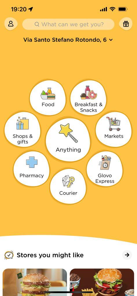
The existing homepage was simple and recognisable, but most of its initial space was dedicated to category selection
Problem
The homepage worked well as an entry point into Food, but gave limited visibility to other parts of Glovo.
Available data showed that:
- 90% of orders originated from the Food vertical
- Only 30% of users scrolled to see homepage widgets
- Despite limited visibility, widgets influenced 15% of all orders, with "Order Again" being the strongest performer
- 30% of searches were initiated directly from the homepage
User interviews also showed that:
- Users saw the homepage mainly as a category selector rather than a place to browse.
- Many associated Glovo primarily with food delivery and had low awareness of other categories.
- Users appreciated that the existing homepage was simple, friendly and not overwhelming.
The opportunity was therefore not to replace a broken homepage, but to make already useful content easier to discover and to improve awareness of services beyond food.
Hypotheses
I explored three hypotheses:
- Bringing more relevant widgets higher on the page could help users discover services and stores beyond food.
- Reducing the prominence of category bubbles could create space for discovery without making the homepage harder to use.
- Making search more visible earlier in the journey could encourage users to explore across categories rather than only after entering Food.
Approach & Decisions
I explored a homepage structure that kept direct access to categories, while giving more prominence to content that could broaden discovery.
The proposal focused on three main changes:
- Bringing widgets such as stores, promotions and personalised content higher in the experience.
- Making search easier to access from the homepage, with copy that suggested a wider variety of products and services.
- Reducing the visual dominance of category bubbles while keeping them available as a familiar navigation entry point.
Search was particularly relevant because many users searched only after entering the Food category. Starting search from the homepage created an opportunity to expose users to groceries, retail, pharmacy and other types of content earlier in their journey.
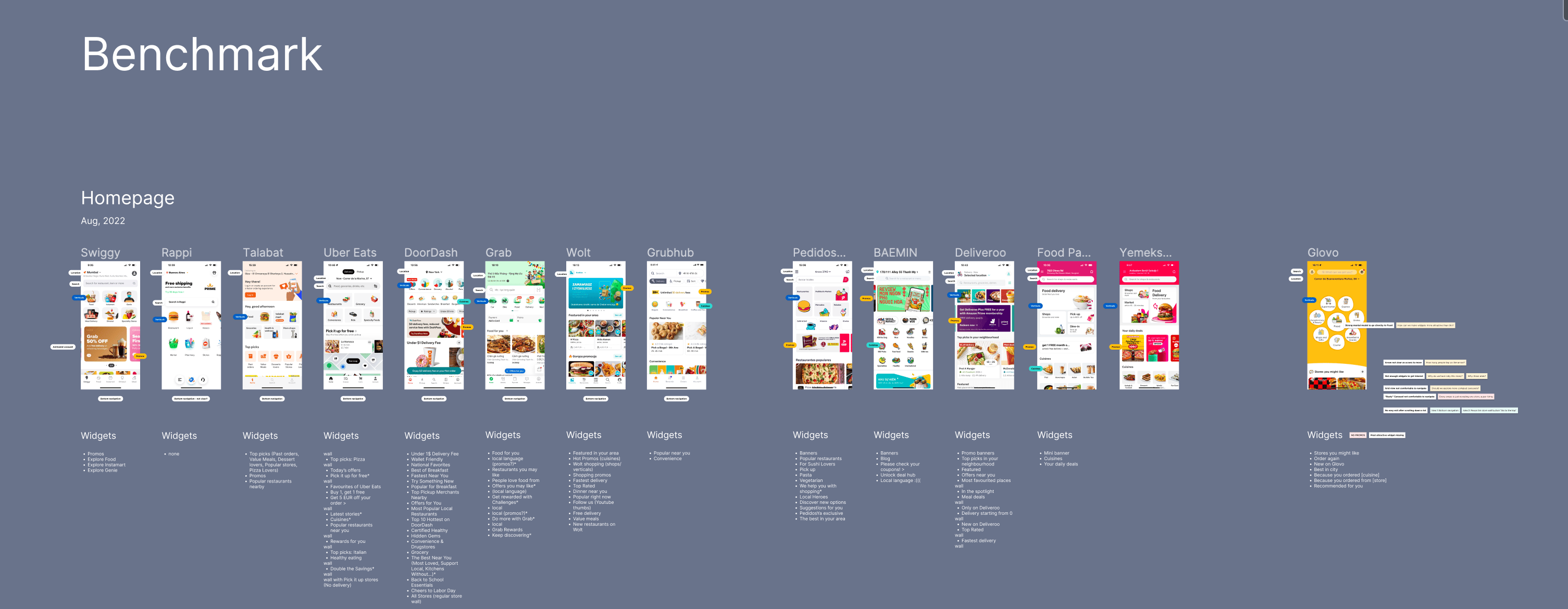
I also reviewed competitor homepages. Compared with Glovo’s minimal approach, many competitors surfaced stores, promotions, cuisines or other content earlier, and several used bottom navigation to support movement between key areas of the app. This helped frame the exploration, although the aim was not to simply copy a more content-heavy pattern.
Early feedback
During interviews, users confirmed the value of the existing homepage: it felt simple, friendly and playful compared with more crowded alternatives.
At the same time, the proposed structure encouraged more exploration. In early feedback sessions, 4 out of 5 users started browsing the proposed homepage without prompting. Promotion-related widgets attracted attention, and several users were surprised to see that Glovo also offered products such as electronics, confirming that awareness beyond food was still limited.
Stakeholders also responded positively to the improved widgets and stronger visibility of other verticals. However, they were concerned that a drastic redesign could remove the simplicity and distinctive character associated with Glovo’s homepage.
[Image suggestion: proposed homepage with highlighted examples of promotions, non-food services or electronics content]
Several users engaged with content beyond food during early feedback, including products they had not expected to find on Glovo.
Outcome
The original concept was not taken forward as proposed.
Instead, the team continued exploring less disruptive ways to increase the visibility of widgets while preserving the simplicity of the existing homepage.
Looking at the product today, several of the directions explored in this work — including increased widget prominence and a stronger focus on personalized entry points — have become part of the experience, although through different implementations and iterations.