Glovo • 2023
Ongoing Order Experience
Explored a new ongoing order experience to make order progress, delays, and delivery issues easier to understand after checkout
Post Order
Communication Design
Order tracking
Context
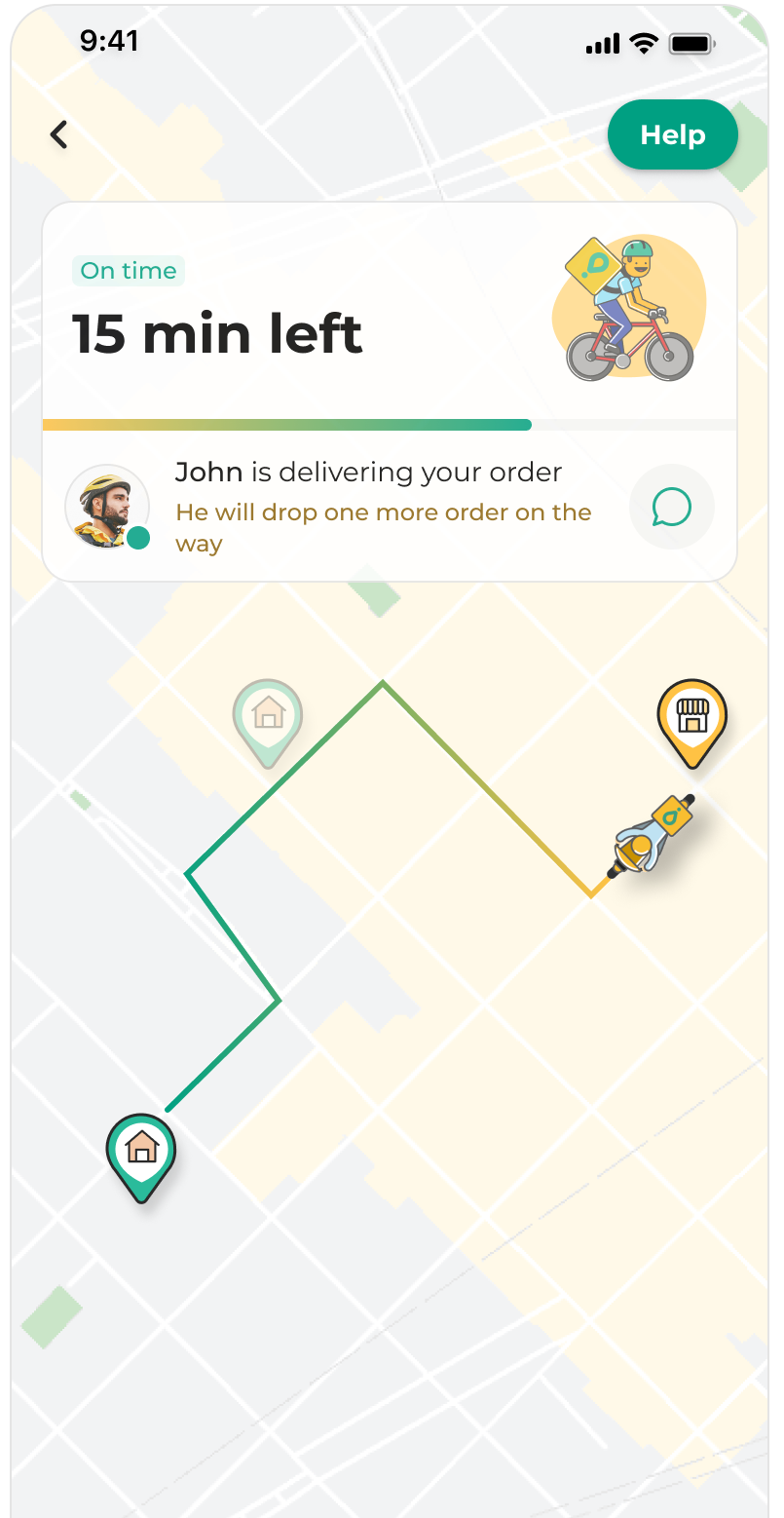
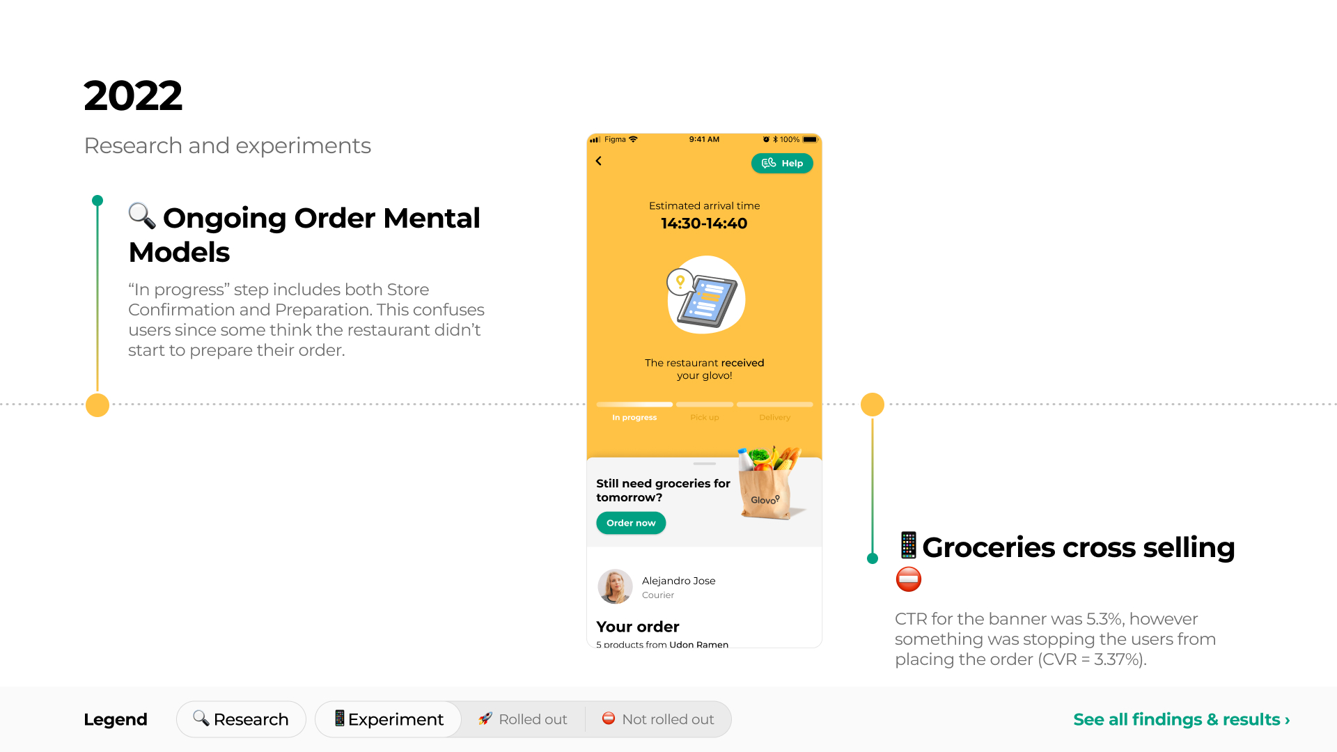
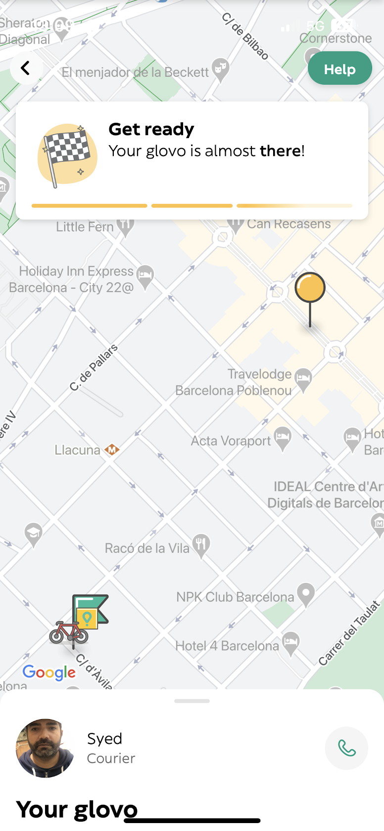
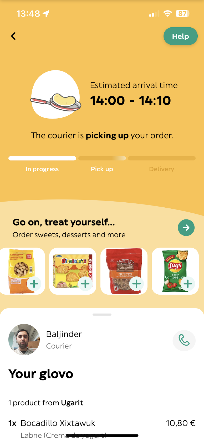
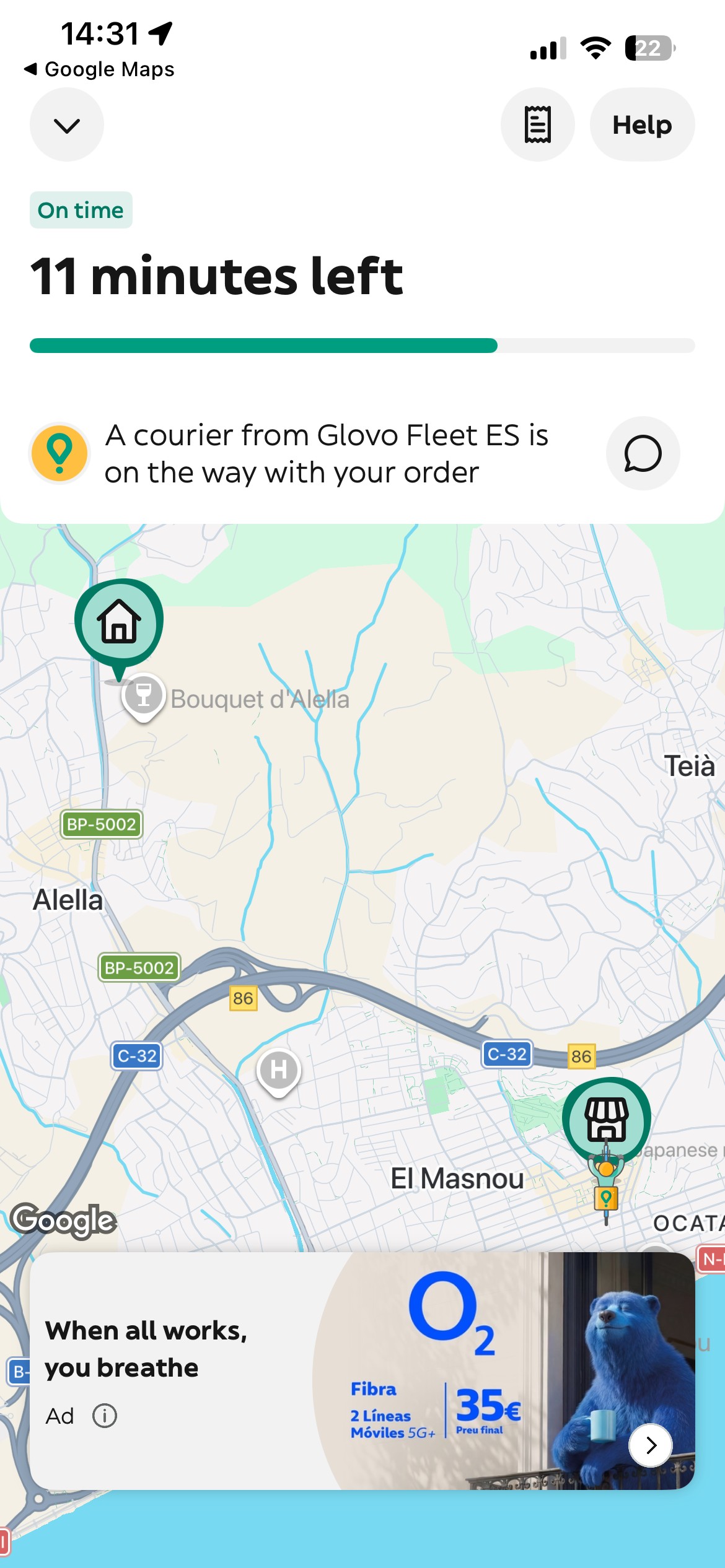
The ongoing order screen is where users follow what happens after placing an order: whether the store has accepted it, when it is being prepared, whether a courier has been assigned, and when it will arrive.
Before exploring a new direction, I reviewed the evolution of this experience since 2019, including 11 research studies and 29 experiments related to order tracking, delays, cancellations, support contact, delivery communication, and exception cases.
Previous work had improved individual parts of the journey, such as ETA communication, late-order messaging, order changes, contact options, and Live Activity. However, the core experience still relied on a small number of broad statuses that did not fully explain what was happening during delivery.
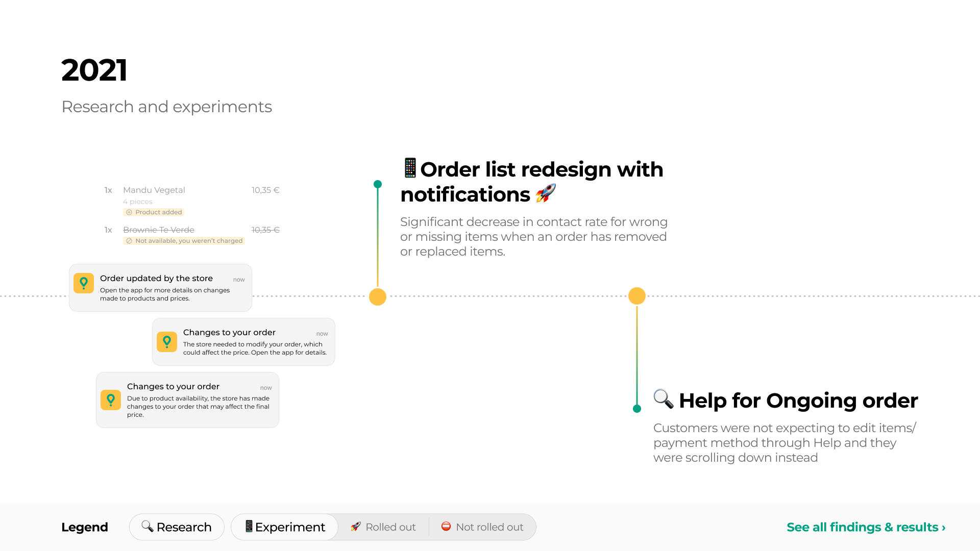
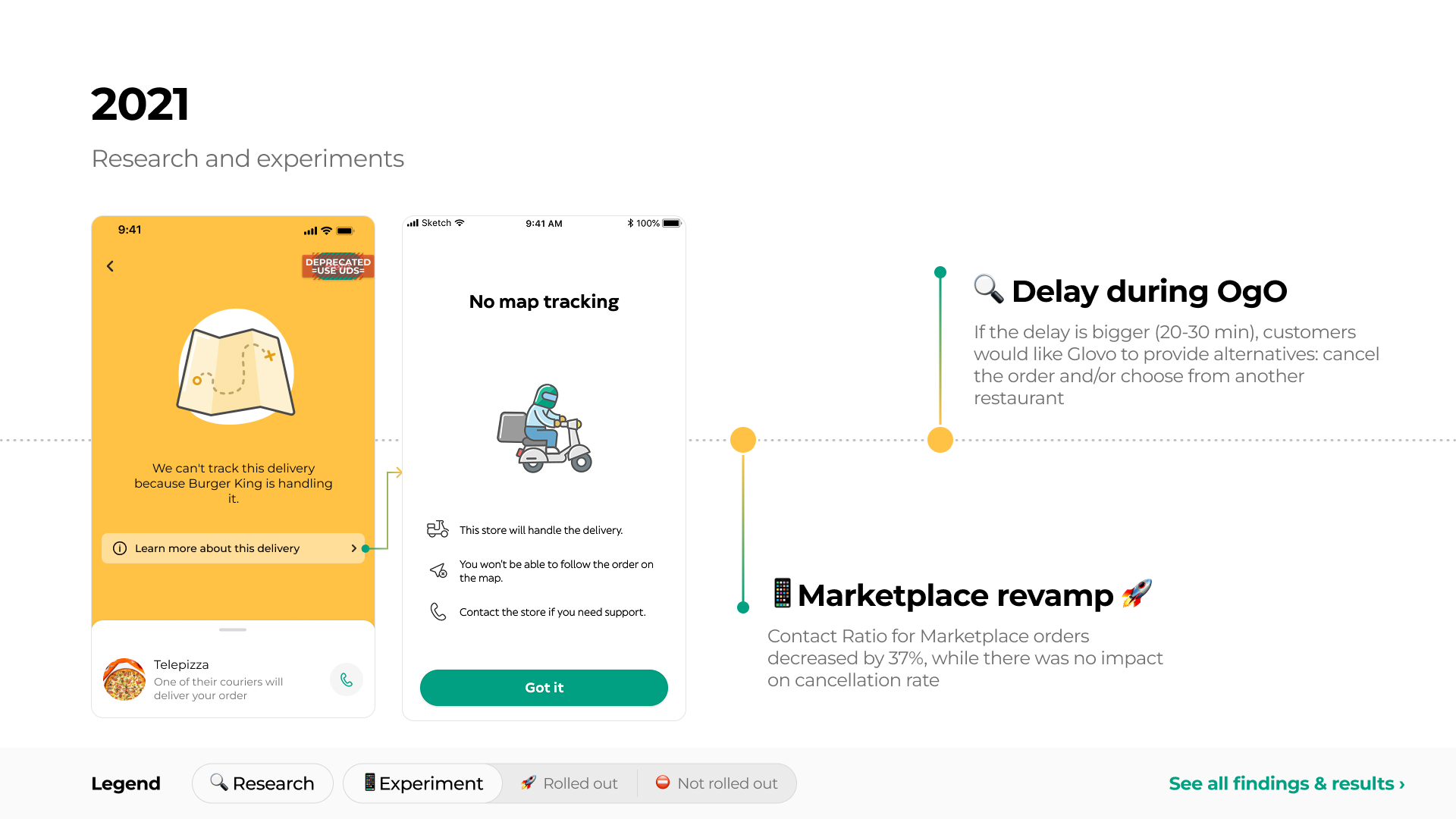
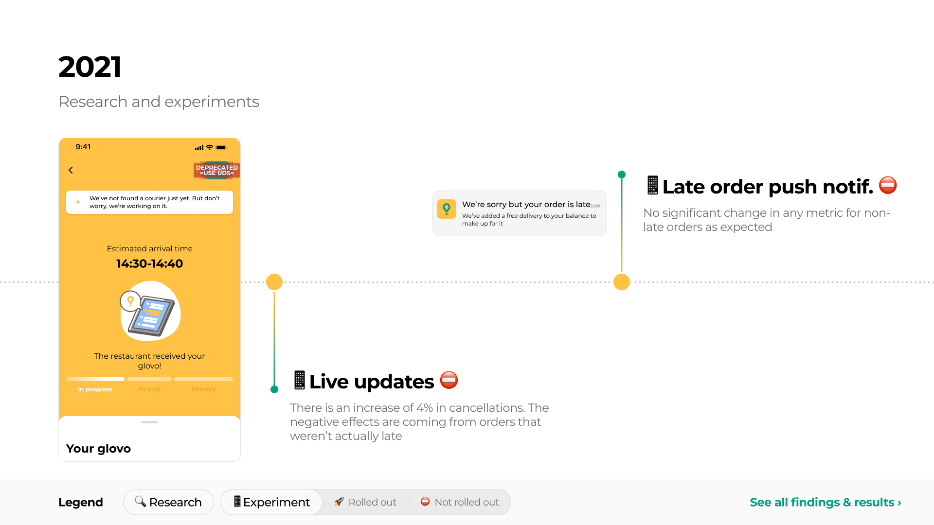
The ongoing order experience had been tested and improved repeatedly over several years, but most initiatives focused on individual moments or features
Problem
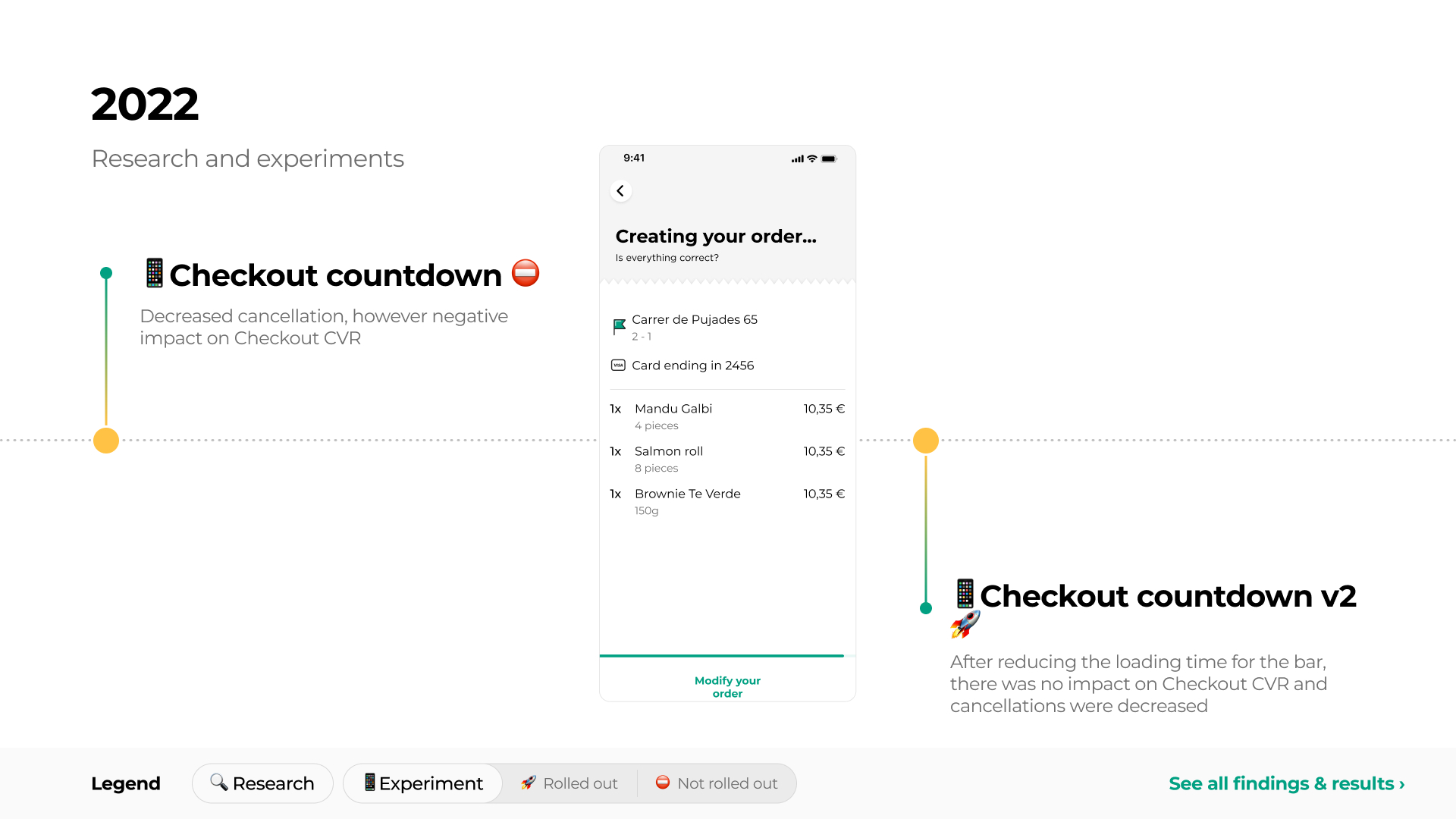
The existing experience presented order progress as a simple sequence of steps:
In progress → Pick up → Delivery
This structure hid important information from users.
“In progress” combined several different situations, such as waiting for the store to accept the order and the store preparing it. “Pick up” was presented as a longer stage, even though users often understood pickup as a quick moment. When that step lasted longer than expected, users had little indication of whether the store was still preparing the order, the courier was waiting, or a delay had occurred.
Previous research also showed that users wanted more specific information during uncertain moments:
- During delays, users wanted to understand whether the issue came from the store or from the courier.
- Users wanted updates from both the store and courier side throughout the journey.
- Long pickup periods created concern because users expected collection from the store to be quick.
- In exceptional situations, such as bundling or courier reassignment, users wanted more transparency about what was affecting their delivery.
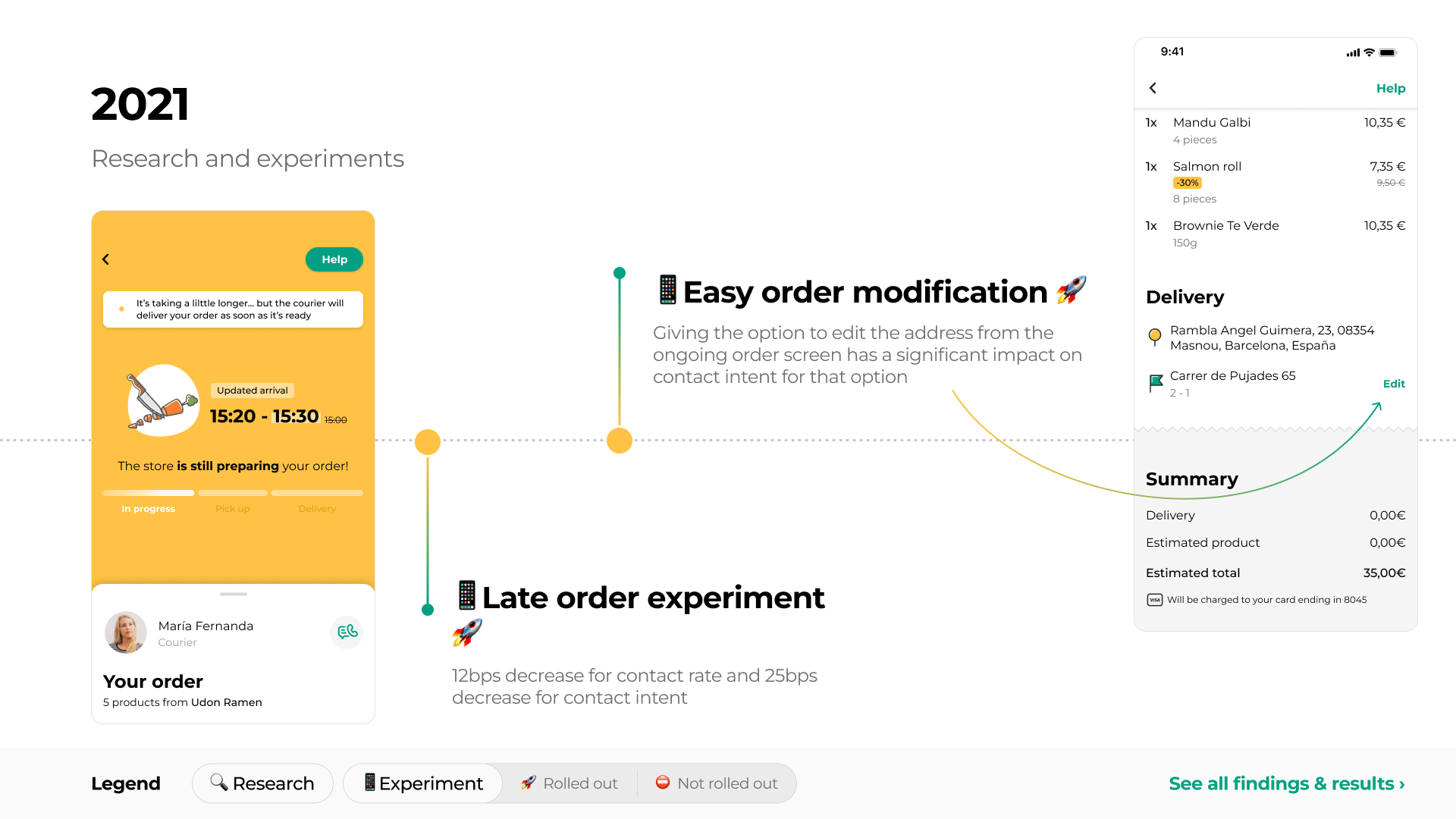
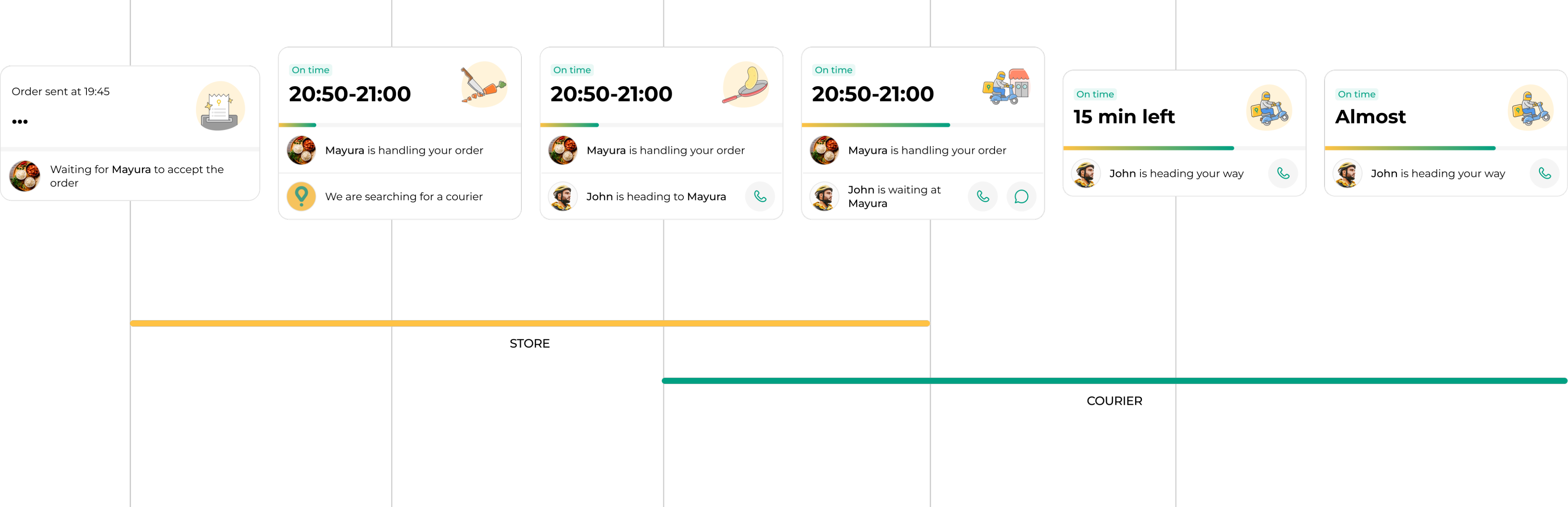
The ongoing order experience when starting to work on the project
Main Insight
The delivery journey was not a single linear process. It involved two parallel timelines:
- the store accepting and preparing the order;
- the courier being assigned, travelling to the store, waiting, collecting the order, and delivering it.
Both could be relevant at the same time. For example, the store might still be preparing the order while the courier was already waiting outside.
The existing design communicated one update at a time, which made the experience feel static and gave users too little information precisely when something was taking longer than expected.
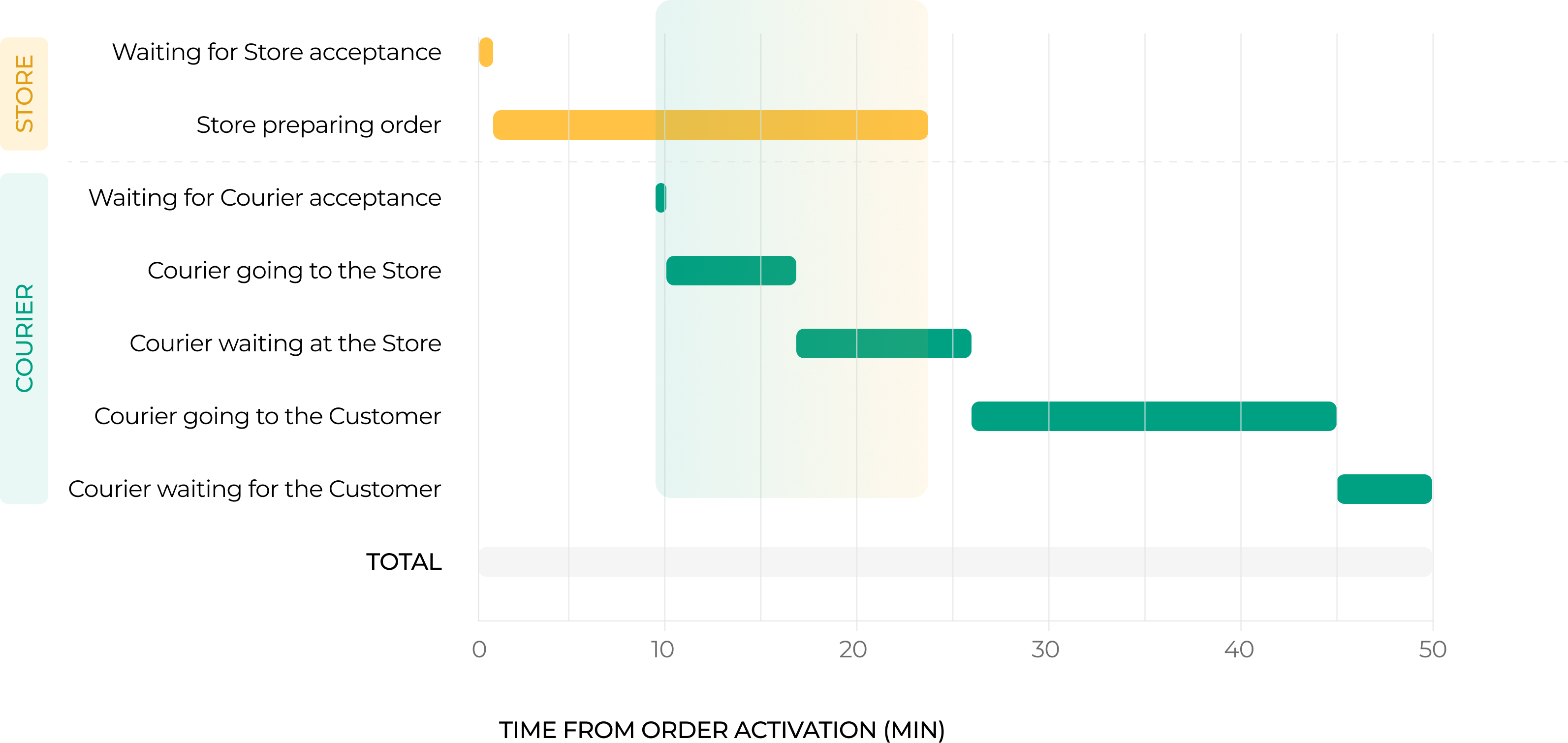
The existing status model reduced two parallel processes — store preparation and courier movement — into one simplified sequence of updates.
The key shift was moving from one broad delivery status to separate store and courier progress
Approach & Decisions
I explored a more flexible ongoing order screen that could communicate both store and courier progress throughout the journey, rather than switching between a few broad stages.
The direction included:
- Separating store status from courier status, so users could understand what each side was doing.
- Replacing broad or misleading stages with more specific updates.
- Keeping ETA visible while explaining changes when the order was delayed.
- Showing relevant actions depending on the situation, such as contacting the courier, adding delivery instructions, or reviewing order changes.
- Creating a structure that could support normal delivery as well as less common but important cases, such as delays, courier reassignment, unavailable products, split orders, or bundling.
Instead of showing one broad status at a time, the proposal kept users informed about both store and courier progress as the order moved forward.
Communication Across Channels
The ongoing order screen was only one part of how users received information after checkout. Updates could also appear through the Homepage widget, order list, push notifications, Live Activity, email, and support.
Together with designers and researchers from related product areas, I worked on mapping communication across these channels for key moments in the journey, including:
- store acceptance and preparation;
- courier assignment and pickup;
- delays and updated ETAs;
- cancellations;
- unavailable products;
- bundling;
- customer absence at delivery.
This helped identify where the same event was communicated inconsistently, where information was missing, and where an update could be surfaced earlier or through a more useful channel.
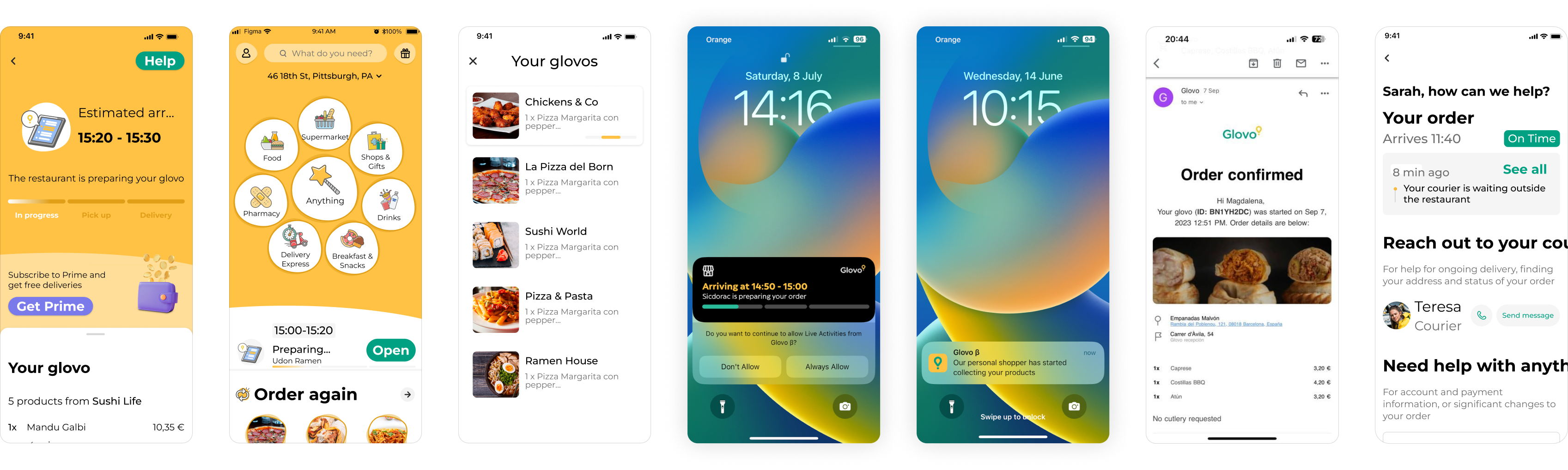
Mapping the same event across channels helped identify gaps and inconsistencies in how delays and other important updates were communicated.
Example Scenarios
Delays
When an order was delayed, the proposed experience explained what had changed instead of only showing a later ETA. Depending on the situation, users could see that the restaurant was busier than expected, that a courier was still being found, or that a previous courier could no longer continue.
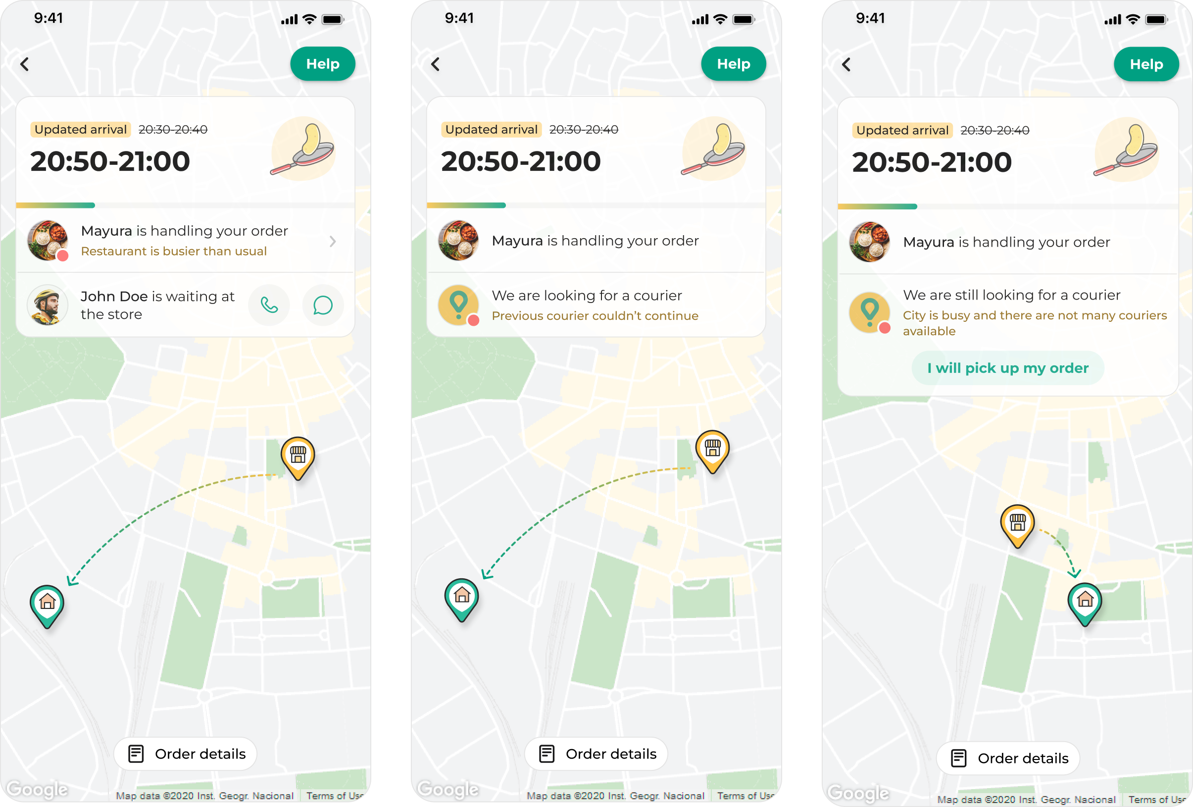
Updated ETAs were paired with a reason for the delay, helping users understand whether the issue came from preparation or courier availability.
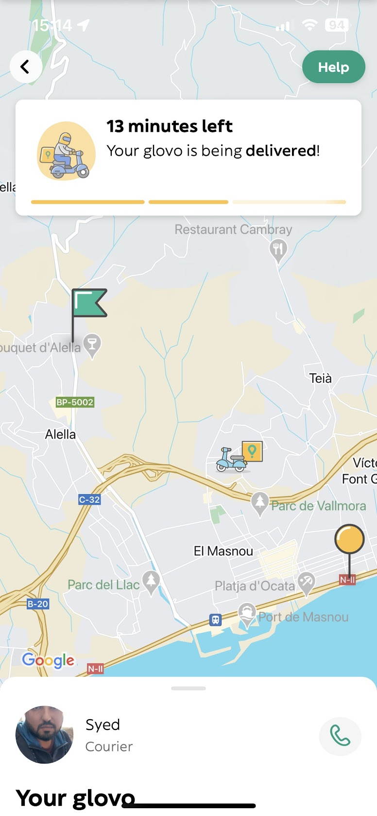
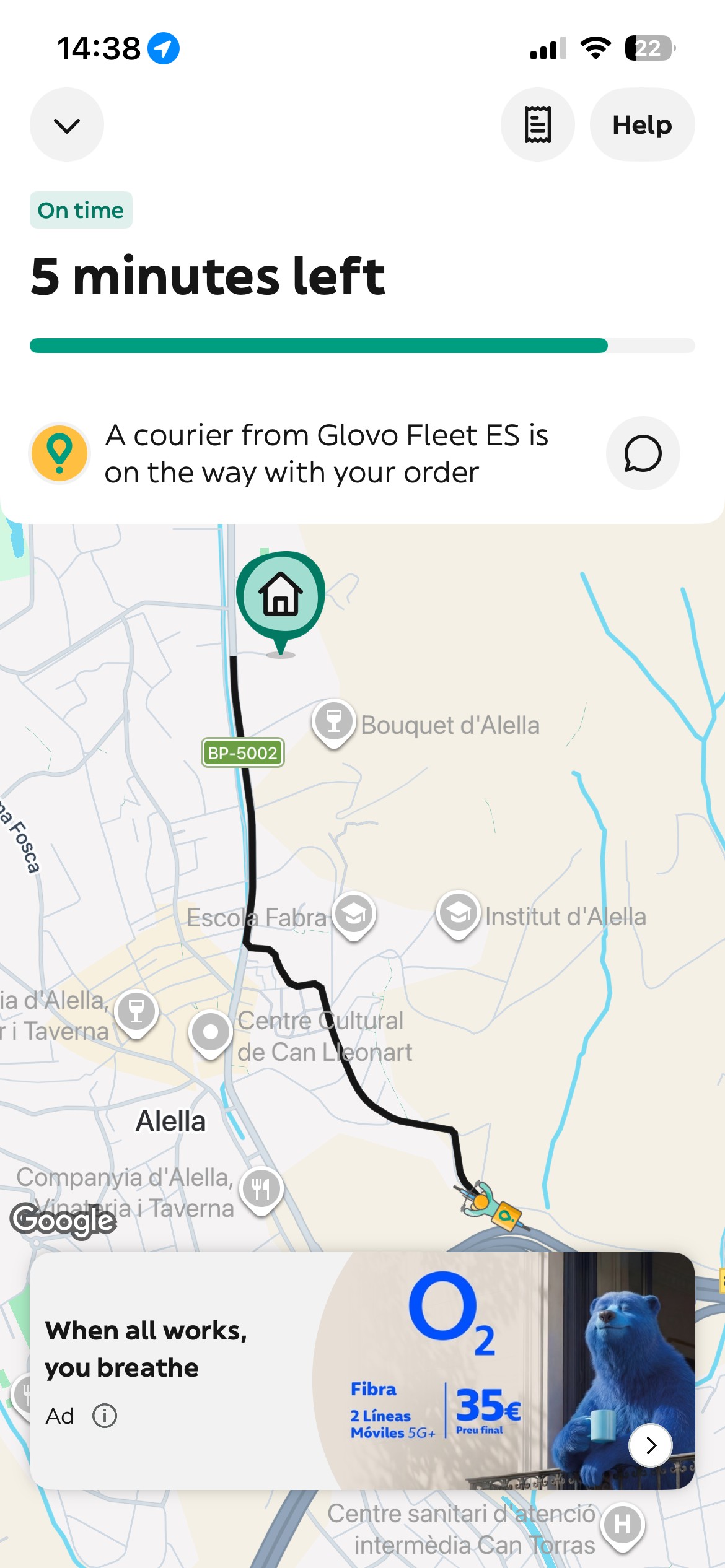
Final Delivery Steps
As the courier approached, the experience surfaced the delivery details users might need to confirm or improve before arrival. Users could add delivery instructions for difficult entrances, and switch from a standard map to a 3D view when more spatial context could help pinpoint the exact location.
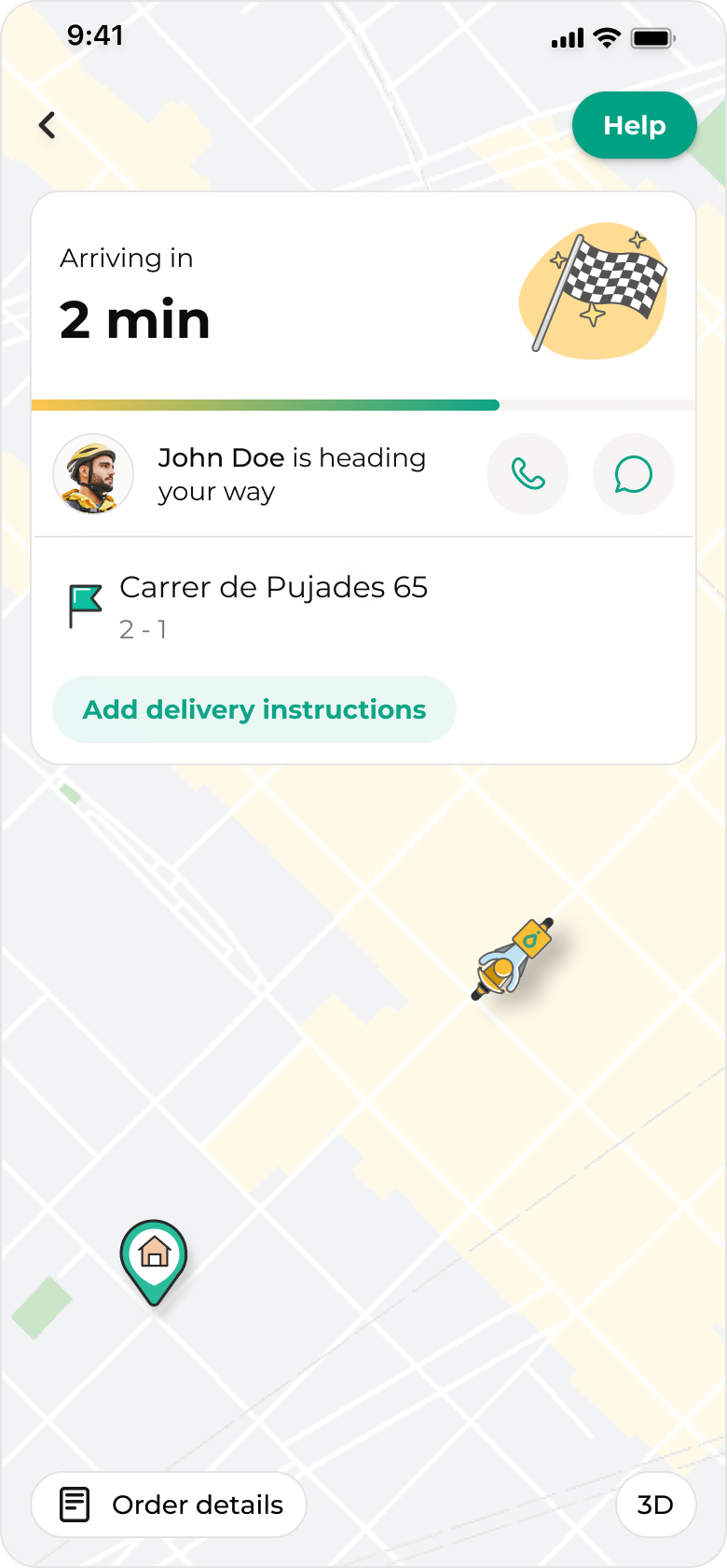
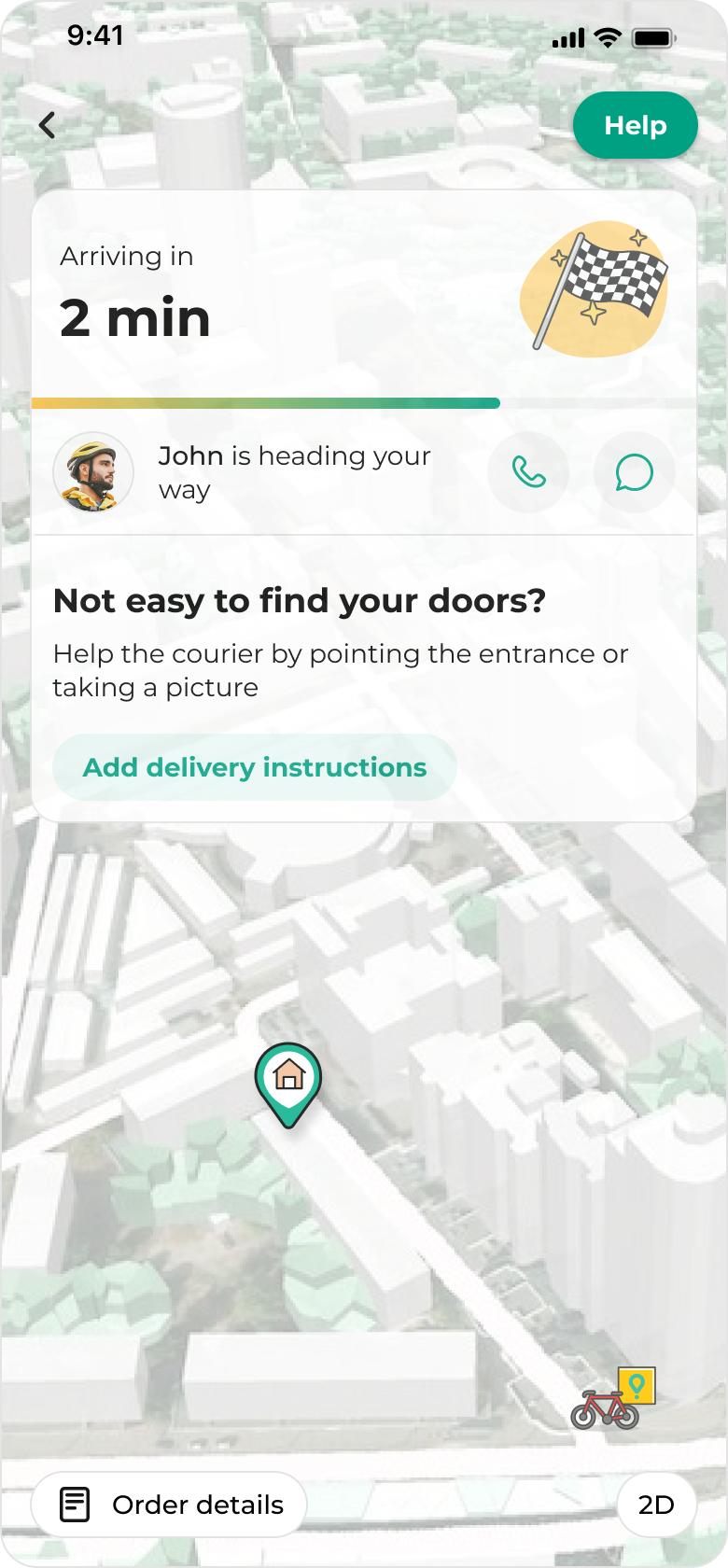
Relevant actions were brought forward before arrival: users could add delivery instructions or use a 3D map view to make the building and entrance easier to identify
Bundling
For bundled orders, the existing experience could show a route that did not explain that the courier was making another delivery first. The proposal explored communicating this directly while reassuring users that their order was still on time.
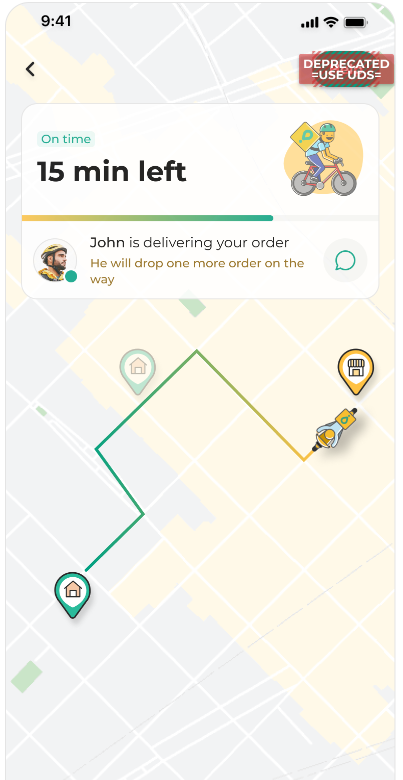
For bundled deliveries, the proposal prioritised transparency over hiding operational complexity.
From broader concept to MVP
The broader proposal explored a more flexible ongoing order experience that could support both normal delivery and complex cases such as delays, courier reassignment, bundling, unavailable products and multiple active orders.
Before going on maternity leave, I narrowed this into an MVP direction focused on the most important moments of uncertainty: store preparation, courier assignment, pickup, delivery progress and delays.
The MVP kept the core principle of the proposal — separating store and courier progress — while making the experience realistic to implement.
For delays, the MVP explored different operational causes, such as partner saturation and city saturation, so users could understand not only that the ETA had changed, but why.
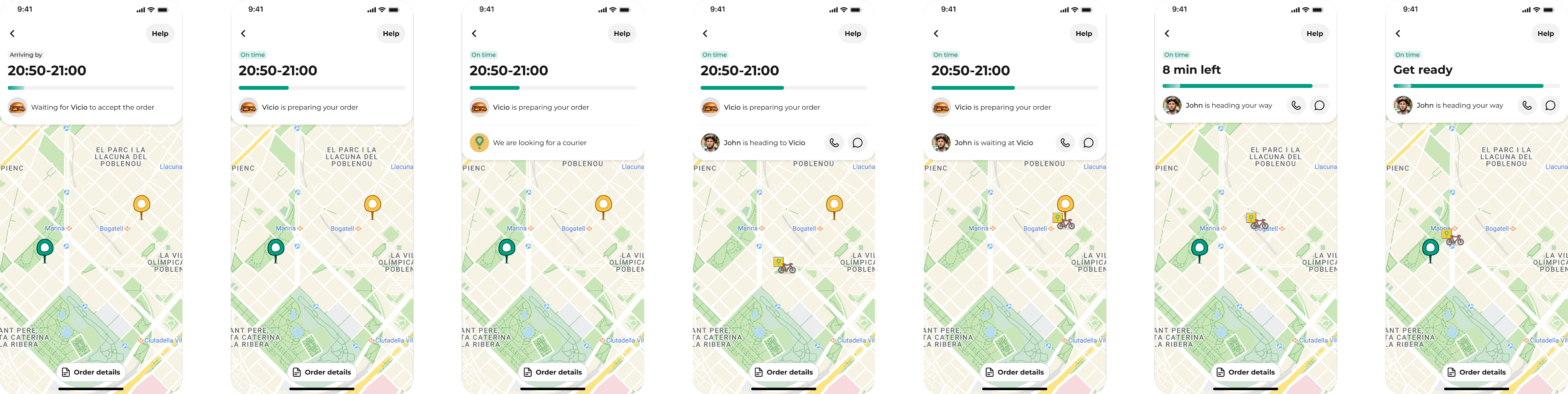
MVP designs - all stages of the delivery experience
Outcome
The core direction was later implemented and rolled out by the team. While the final experience differs in some details, the current implementation closely follows the MVP direction I proposed before handoff: clearer delivery stages, separated store and courier updates, and more specific communication around delays.
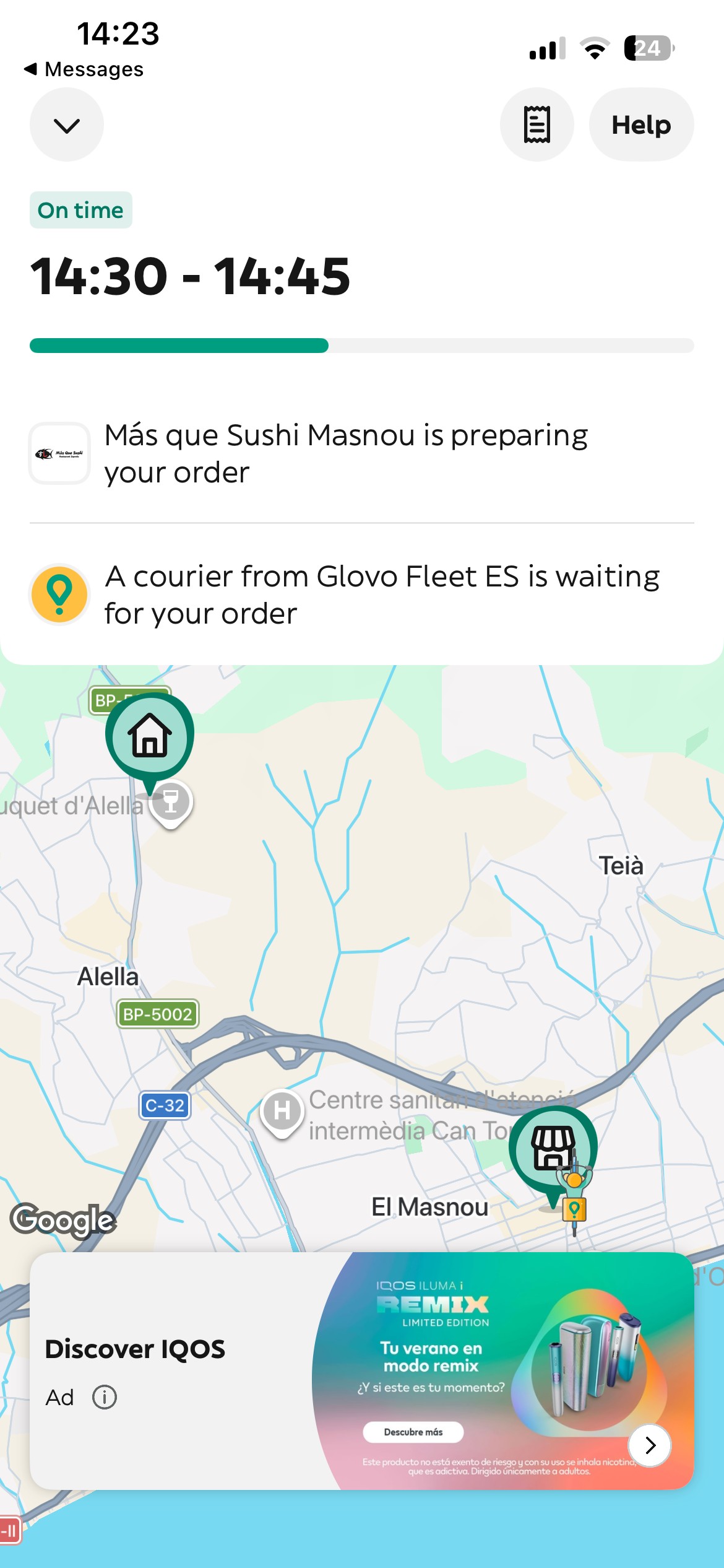
Current implementation in the app
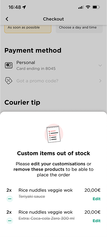
Checkout Error Recovery
Improved recovery for unavailable customisations, increasing conversion from error to order by ~10%
See case study →